
动画
过渡动画 transition
https://developer.mozilla.org/zh-CN/docs/Web/CSS/transition
- transition-property: CSS 属性
- transition-duration: 时间
- transition-timing-function: 过渡函数
- transition-delay: 出现的延迟时间
css
transition: <property> <duration> <timing-function> <delay>;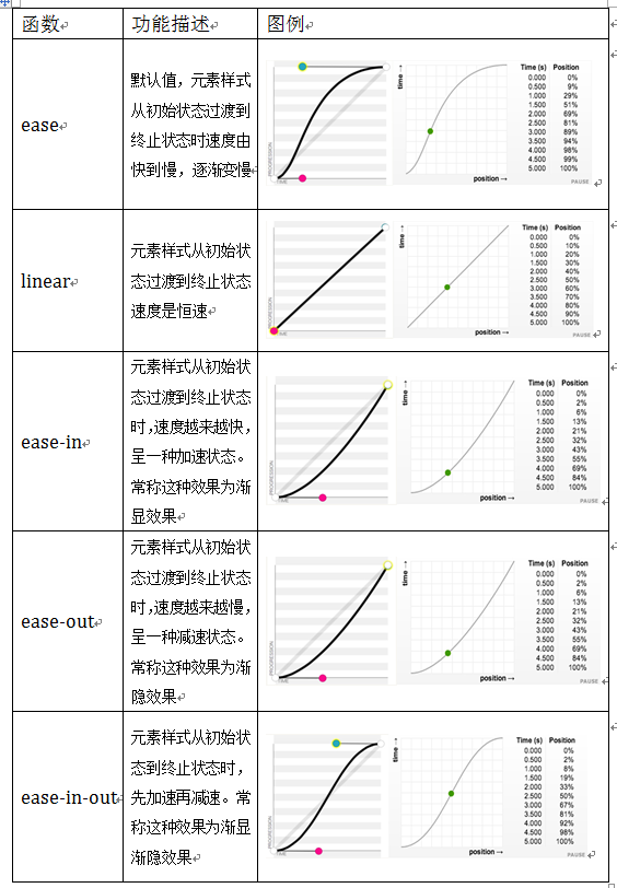
多个可以使用 , 分割,如:
css
transition: margin-right 2s, color 1s;示例:
css
div {
  width: 50px;
  height: 50px;
  transition: all 1s;
}

div:hover {
  width: 100px;
  height: 100px;
}@keyframes
https://developer.mozilla.org/zh-CN/docs/Web/CSS/@keyframes
和 转换 transition 相比,关键帧 keyframes 可以控制动画序列的中间步骤。
keyframes 是定义动画,而使用则需要使用:
- animation-name
- animation-duration
- animation-timing-function
- animation-delay
- animation-iteration-count / 播放次数,如:4、infinite 等
- animation-direction
- normal 正向播放,重置为起始状态并重新开始
- reverse 反向播放,重置为结束状态并重新开始
- alternate 交替播放,第一次迭代是正向播放
- alternate-reverse 交替播放,第一次迭代是反向播放
- animation-play-state
- running
- paused
- animation-fill-mode
- none
- forwards 保留最后一个关键帧计算值
- backwards 动画将在应用于目标时立即应用第一个关键帧中定义的值
- both 遵循 forwards 和 backwards 的规则
css
/* @keyframes duration | easing-function | delay |
iteration-count | direction | fill-mode | play-state | name */
animation: 3s ease-in 1s 2 reverse both paused slidein;

/* @keyframes duration | easing-function | delay | name */
animation: 3s linear 1s slidein;其他
示例:https://codepen.io/airen/pen/qBRzrG